Composition in Motion Design
You only need to focus on one composition within illustration, but with motion design you also need to keep an eye out on the composition of the in-between frames. Each frame counts, as the saying goes! Many illustrators sketch motion frames (the in-between frames) as a guide for specific placements for the animation. I'll go over a few of the techniques I always use in storyboarding. But first, a short introduction about composition itself:
What is composition?
"Good composition is like suspension bridge - each line adds strength and takes none away" - Robert Henri
Composition means arranging and organising all the stuff you see in a frame. When you get a composition right, it grabs attention and leads the eyes of the viewer along with your story or message. When creating motion design compositions you need a mix of creativity, experience, and technical skills.
Composition Tips
1. The Rule of Thirds
This principle applies across various art forms! Maybe you have heard of it before? It's very popular in photography. The rule of thirds involves dividing the frame using a 3x3 grid. By placing key elements along these gridlines or at their intersections, you can establish balance and harmony. Utilise this technique to position focal points and create motion paths that guide the viewer's gaze through the animation. In the example below, you can already anticipate the next shot, such as the character walking through the hospital's front door. This method is excellent for balancing illustrations and proves valuable for diverse drawings. However, it might occasionally be ambiguous if it's effective, especially when dealing with numerous elements. It tends to work best with 1 or 2 focal points.

2. Hierarchy and Depth
Hierarchy and Depth: Placing everything at the same level can be quite boring. More prominent elements should be larger, draw attention and tell the story. Smaller elements should support that message but not take up the main focus. By adding layering, a blur effect or parallax effects you can create dimension in your work. Another technique here is playing with for-, middle- and background compositions.

3. Camera Angles
When you start your motion design career you will find a few frames that might return in each storyboard. Someone holding a mobile phone or sitting behind a desk for example. By adjusting your camera angle you can make this scene more interesting and different each time. Each angle can have a different purpose, maybe the screen needs to be visible or only the characters expression. I'd like to use certain shot terminology with this technique, this way I can explain in a professional way why I used a camera angle or what the purpose is of it.

That's it! ✌
In the realm of motion design, it's not just about slapping a bunch of frames together, they need to follow a coherent storyline. I hope these techniques can guide you and help you give more meaning to your composition!
Practise Brief & Freebie to Download 👇
Here is a little freebie to get you started with your composition skills.
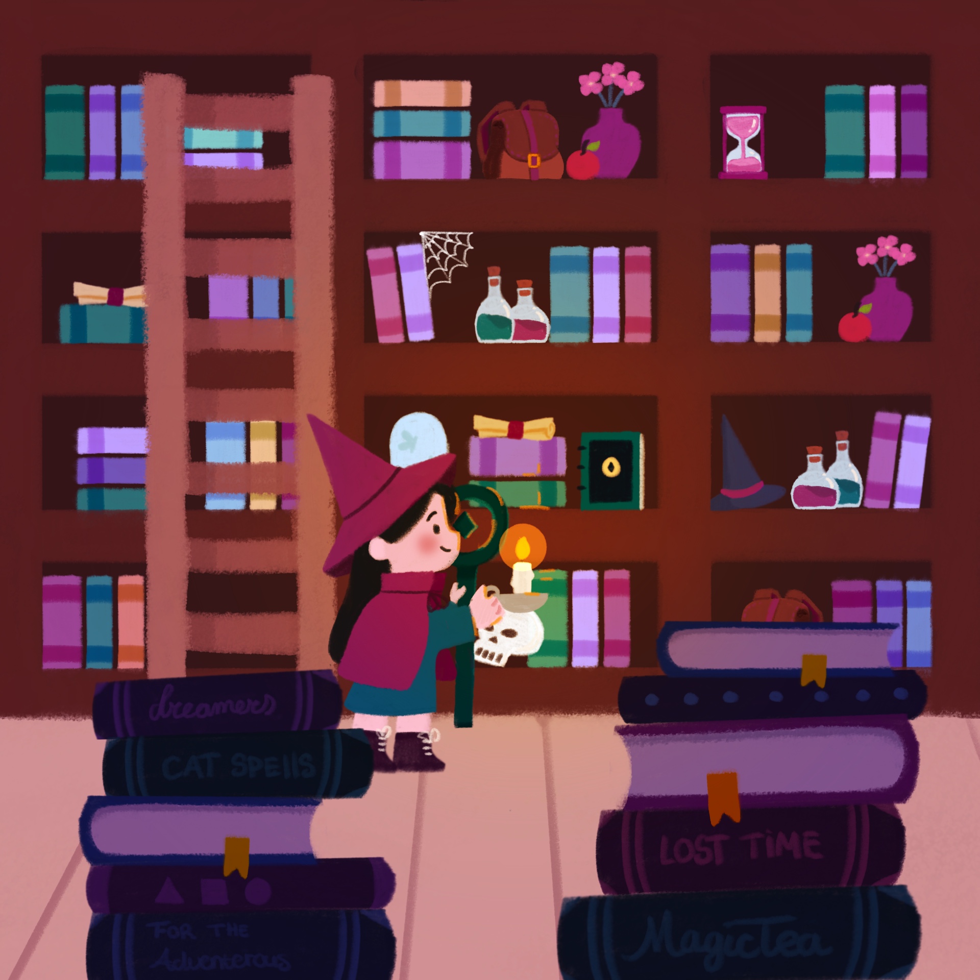
⭐ Level 1. Why not try to make a balanced composition with these objects and try to add some elements of yourself!
⭐⭐ Level 2. If you want to take it up a notch. Create two shots where the items move from one place to another.
⭐⭐⭐ Level 3. Now for the extra fun part: create the in-between shot.


